Wednesday, May 30, 2012

The Christmas Sprirt

Yea! Finished the first of my 2012 Christmas Cards - 16 down and many more to go. I am determined that I will not be working on these at the last minute - and yes, making Christmas cards is going on my summer vacation "to do" list. Only two more weeks!

This MFT image is called Holiday Hugs. He is stamped on copic x-press-it in memento black and colored in copics. The DP is from my stash and layered on SU cardstock: artichoke layered on a cherry cobbler base. The white in the top corner is SU shimmer white that has been dry embossed in a snowflake design. The scallop and circle images are nestabilities dies. The greenery is a MS fern (thank you Jan) and a very old holly. The image and greenery are spritzed in perfect pearls mist. The snowflake is punched from SU glitter cardstock. I love this paper - it has the most sparkle of any glitter paper and doesn't flake off. Small crystals are scattered in the greenery.

Copic colors used:
Hat: BV23, C5, C7, C9
Snowman: C1. B60, and 0
Nose: YR15, YR18
Scarf: Red: R29, R39, R59
           Green: G24, G94, G99
Shadow: G40, BG70, 0

MFTWSC74

I managed to meet the challenge early this week by making a card for my friend using the Best Medicine set. The image is stamped in memento black on neenah solar white and colored in copics. The DP is from My Mind's Eye: Lost and Found - Breeze. The chocolate satin ribbon and pearls are from SU as is the handsome hunter cardstock (retired). The scallop and circle dies are from nestabilites. The inside MFT dies are  the Flower Trio and the small Flourish.

Colors used:
skin: E30, E00, E21, R20 & R00
hair: E 53, E57, E59
apron: E41, E40 and 0
dress: BG 70 and bridge to BG72
shoes and bag: C1, C3, C5cross: R14 and E08
clipboard paper: E 41 and 0
clipboard: E53, E55
background: BG70 and 0
The inside pearls are colored with BG72


Monday, May 28, 2012

Meeting the challenge

I love rainy holidays: I spent the day cleaning up my table and letting myself get distracted by the other new MFT stamp set that will be available in June: Sprinkler Girl. She is stamped in Memento Black onto copic's x-press-it white cardstock. The DP is" my mind's eye" Six by Six and called Everyday Flair. The cs is from SU: blush pink and sage (both retired). Two embossing folder are used; the square lattice is from SU. Distress inks are blended onto the paper edges. The MFT vertical greeting die is used. The sun is cut from two circles. The center is 3/4 inch. The outside wedges are cut from a 1 1/4"  circle. The hair flower is colored using a  turquoise spica pen. A small crystal is glued to the center.

She is colored with copics:
skin: E50, E00, E11 with R20 & R00
hair: E13, E35, E37
grass: G40, G61, YG63
water: BG10, B91 and sakura stardust gel for sparkle
hose: C3, C5

Playing with Spraying

This has been such a wonderful weekend - very relaxing. I have caught up on some reading and spent two days playing with the "cult." Anita hosted a gathering at her house. We met on Saturday afternoon and the time just flew by; we had such a wonderful time that we invited ourselves back for Sunday.

Ever since we took the online lettering course, Anita and I have been talking sbout getting together to play with our sprays and stencils. We both have ordered sets of the dylusion sprays and some crafter workshop stencils and tried them out - but without much success. We were discouraged by our results, but have seen others use these supplies successfully so we decided that we needed to set aside a chunk of time and space to just play. After watching lots of videos (especially at joggles.com) we gathered supplies and cult members and just played. The slideshow below shows the fruits of our efforts. I am pleased and more at ease using these products; some techniques still need more practice. I am glad that summer vacation is almost here. I wonder how long it will be before the dye comes out of my fingers?


This is the handout including information that I researched before we met to play:

Backgrounds : Joggles and searching youtube for dyan reaveley are great resources
Stencils can be purchased or cut from transparency using your die cut shapes. A die cut can be used as a reverse stencil – perfect for a journaling spot

Slicker surfaces (like manila tags) allow time for inks to blend whereas watercolor paper absorbs ink quickly.

Colorwash has very deep colors – dilute in water (to your color preference) and spray over stencils. This is also  a textile medium
            Mist surface heavily with water first and then work light to dark and then let dry
            To lighten the color you can blot with paper towels or another tag
            You can use a brush to move color around on the surface.
            Secondary layers of spotty color can be added from swiping through overspray on mat
            Use a brush to pick up spray from mat and color stamped image
            Can be added to an aqua pen with some water to use for watercoloring
            Can be sprayed on a craft mat (with a bit of water) and pounced onto a bold stamp
            Can be sprayed over a gel medium (gloss or matte) resist
            Can be sprayed over gesso (that has dried) and it will absorb a second application of color

dylusions is intense color, but not as dark as colorwash. This is not intended for fabric. These sprays blend more easily than colorwash and are more reactive with water.
            Many of the above techniques will apply to this medium
            Use related colors – yel/orange/pink or yel/green/blue so you don’t get MUD
            Create GHOST images on a dry, dark surface by spraying with water, leave for 15 sec, then blot.
            After spraying, flip stencil over and “stamp” the reverse image on another background
            Heat drying will stop next color layer from blending
            Build layers of color

 Adding more visual texture to a colored base
            Stamp with archival for clear image, stamp with distress for blended images (use mega BG stamps)
          Splat with distress stains
            Use pearl mists as water, over the entire surface or through a stencil
            Crumble saran on a wet surface and let dry (better on tags) Gesso can highlight the texture.
            Add luminere to crumpled wax paper and gently touch to surface
            Add ink to bubble wrap and stamp
            spread acrylic paint in a thin surface on a craft mat and use to ink found items (bubble wrap bottle lids for open circles)
            glue on stamped and cut out images (text paper)
           stamp through stencils for partial images
            use blending tool and distress ink (on edges, through stencil)
            use blending sponge to apply versamark through stencil and emboss
           Spray ink over dry gel medium (gloss or matte) image for a resist (clean image quickly after gel is used)
           Apply metallic rub-on paint or ink gold through stencil
           Goosebumps acts as a resist.

Have fun getting messy!

MFTWSC73

Yea, No work today so more time to play! I am down to the minute on this week's challenge: besides having spent the last two days playing with the "cult," I was waiting for my new MFT stamps and die to arrive. I love the new Hula Girl and hibiscus flower (especially the leaf). These items will be available to order on June 5. The embossed lines are really perfect. Sorry they don't show in the picture.

The PI was stamped on copic x-press-it white with memento ink. The DP was from echo park (splash) which we received on our Holtz cruise. I didn't care for this pack in the beginning (mostly because of the orange - not my fave color) but have reached for it several times recently. The card base is SU cardstock: taken with teal (retired). The flower is DP and the leaf is SU: limeade. Papers have distress ink blended on the edges. The flower was slightly shaped with a stylus. There are two layers of flowers just slightly off-set. The bottom layer is darkened with an application of discress ink. The image was cut out with the MFT vertical greetings die.

The copics that I used to color this image:
skin: E50, E00, E11 (R20 & R00 for cheek color)
hair: E97, E15, E99
suit: BG11, BG32 with a bridge to BG18
grass skirt: YG03, YG63, YG93
hair flower is a crystal and orange spica

PS: OOPS!  It wasn't until after I photographed and uploaded her that I noticed that I forgot to give her some ground to stand on and some shadows around her. I used E21, E30 and E42 for the sand and BG 000 and BG70 for the shadow. I also accented the inside of the flower. She looks a bit more finished now.


Sunday, May 20, 2012

Graduation Cards

Yea! I finished graduation cards for my senior girls. I used SU cardstock (white, real red, cherry cobbler, ruby red -retired- and black) and DP from SU and Basic Gray. The graduation stamps are mostly retired SU. I used black archival ink and some brilliance (black lightning to highlight and black). A few crystals and some SU ribbon were used for accents. Die cuts include MFT fishtails stax and flower, and the Holtz rosette. Several SU circle punches were used. The "Congrats" embossing folder is from Cuttlebug.

Saturday, May 19, 2012

Challenge revisited

After making a quick visit up to Claires shop today to help celebrate 20 years in business, I finished another graduation card; this one a bit more traditional than the one this morning. I used the same sketch challenge (#72) in our school colors of red and black. Only seven more cards to make this weekend. (Yes, I should have started sooner.)  Graduation Girl is stamped in tuxedo black on solar white neenah and colored in copics. The DP is from basic gray and SU. Pumice distress ink is blended on the edge. The cardstock and ribbon is SU. The image is popped up slightly. I used a doily die from PTI and MFT dies (mini tabs and mini scallop border).

The Copics colors that I used include: the gown is R27, R29, R39; the skin is E21, E11, E13 and R02 for blush; hair is E42, C5, C7, E49; ground is E42, E41, E40; the white items are C1 and 0; the ribbon and shoes are C3, C5, C9.

MFTWSC72

I used this week's sketch to make this card for one of my graduating seniors. Freckles is such a sweet image (but aren't all the PI gals?). Her clothing is paperpieced with DP from lilybeedesigns and is called "Handmade." The card base and layers are SU: white and real red. She is stamped in Tuxedo Black onto Neenah solar white. Brad and ribbon accents are also by SU. The mini tab die is used for the verse and  the mini scallop just peeks out. Copics are used to shade the paper pieces as well as color the rest of the image. A list of markers used can be found toward the end of this post.

The main image is popped up so the ribbon tabs tucks under neatly. I just layered and folded short pieces of ribbon, stapled the end and slipped the brad prongs under the staple before inserting behind the layered image.
Markers used for shading the pants and adding background shadow was BG000 (plus 0 for the background). The top was shaded using Y21. Skin is E50, E000, E11 and R20 for blush. Hair is E31, E33 E35. Shoes are R22, 24, 29 with C1 and C3 for the sole. Grass is a base of YG61 with blades of G24 and G94. A red spica glitter pen adds sparkle to her hair clip.

Monday, May 14, 2012

New Tag Technique

I don't remember where I saw this technique online - but I admired the look and tried to recreate it with this tag. I demonstrated this background technique at our monthly stamp club meeting in St. Augustine today.
1. Color the background of the tag - I used broken china distress stain. It doesn't have to be neat and you can choose your own method of adding color-maybe Dylusion sprays. Dry.
2. Spritz for some sparkle - I used Perfect Pearl Mist in bronze. I think that Inka Gold sponged over would be a great look also. Dry.

3. Dry emboss - I used the Holtz gears folder.
4. Use a blending tool to sponge on ink over the raised areas. I used walnut distress ink.


5. Embellish as desired. I stamped a new MFT promotional sentiment on vanilla cardstock that was die cut with a MFT vertical greetings die and then I blended some antique linen distress ink around the edges. I went through my stash and found some Holtz gears and a paper and a metal flower; I colored some pearls with copics; added some Hero Arts sequins, some then Swarovski crystals. I tied some ribbon and trim at the top and created a dangling charm from crystals and a pearl. The tag is mounted on SU cardstock in expresso (because the metal parts are heavy and it need stabilizing).


Sunday, May 13, 2012

Copic Class samples using Loralie

I have been working on material to teach a new copic class. This intermediate class includes working with different skin and hair colors, as well as how to color an image "white." This was a great stamp to work with to showcase different skin and hair colors. I kept the suits consistent - working with the technique of coloring "white" -to better compare the impact of different skin and hair colors. The card base is SU crumb and marina mist, (individual cards use either peach parfait, pale plum, pumpkin, limeade); DP is from echo park (Splash) and from imaginensce. The wave border is from MFT. Pearls and crystals are from SU and colored with copics.
I tried two different looks for the hair; using a blended technique that requires that the surface stay wet (redhead)  and then one that shows strands of hair (brunette). Spica pens are used to color the eyelids for a bit of sparkle.


Thursday, May 10, 2012

Meeting the challenge with Loralie

For this week's challenge #71, I borrowed a Loralie stamp from Kitty called Beach Bum. I really enjoyed working with the copics on this Loralie lady and plan to do more. The hat became the challenge's circle accent - even it it is on the opposite side.
This is the card that almost wasn't. Last night, I was on the last step - stamping the inside verse, and accidentally brushed the front of the card across the black ink pad. I was so frustrated that I just had to walk away.This morning before work, I deconstructed the card, restamped the verse, trimmed away some of the black edges and relayered. Last night, I tried to wash off some of the ink from the floral background, but it wasn't happening. This morning I had the idea to cut out another flower and pop dot over the place brushed in black. I really like how it worked out. The pearls embellishments are colored with copics to match the rest of the card.


The DP was picked up this weekend at our local shop because I love the bright pink and sea blues. It is from imaginisce. The hat is paper pieced and shaded with copics. I stamped the crown a second time and pop dotted. I tiny twist of tulle was inserted under the bow. I used a MFT die for the inside along with a shell image from the stamp set and some more colored pearls. I included an index at the end of this post.


Thursday, May 3, 2012

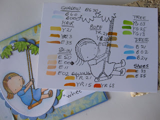
MFTWSC70 - Wheee!

 
This PI girl just makes me smile. She is stamped in tuxedo black on copic X-press it paper. I have included an index of the copic markers that I used at the end of this post.The colors were chosen to match the paper. I usually color the image and then try to find paper; this time I started with DP from my stash and then chose markers to match. The card base and scalloped background (nestablilty die) are retired SU cardstock: Ballet Blue. The thin edge of orange is actually white cardstock that has been inked with honey distress ink.


 I also added honey distress ink to the ribbon (by SU) and to the felt rolled rose (felt and die are both from MFT) because they were just too yellow.  Both the ribbon and the rose are spritzed with Perfect Pearl Misters in Sunflower for a bit of glitz that just doesn't show up well in photos.
The MFT flourish die is set behind the flower. I colored white CS with the same green markers used in the tree leaves because I didn't have the perfect green CS to use. I trimmed the stamp set's sentiment and just used part.It is stamped on white CS cut from the MFT fishtail die (as is the other one on the front and the three on the inside). The end of the fishtail is raised slightly with foam tape.
 I hope she makes you smile too.