Sunday, May 20, 2012

Graduation Cards

Yea! I finished graduation cards for my senior girls. I used SU cardstock (white, real red, cherry cobbler, ruby red -retired- and black) and DP from SU and Basic Gray. The graduation stamps are mostly retired SU. I used black archival ink and some brilliance (black lightning to highlight and black). A few crystals and some SU ribbon were used for accents. Die cuts include MFT fishtails stax and flower, and the Holtz rosette. Several SU circle punches were used. The "Congrats" embossing folder is from Cuttlebug.

Saturday, May 19, 2012

Challenge revisited

After making a quick visit up to Claires shop today to help celebrate 20 years in business, I finished another graduation card; this one a bit more traditional than the one this morning. I used the same sketch challenge (#72) in our school colors of red and black. Only seven more cards to make this weekend. (Yes, I should have started sooner.)  Graduation Girl is stamped in tuxedo black on solar white neenah and colored in copics. The DP is from basic gray and SU. Pumice distress ink is blended on the edge. The cardstock and ribbon is SU. The image is popped up slightly. I used a doily die from PTI and MFT dies (mini tabs and mini scallop border).

The Copics colors that I used include: the gown is R27, R29, R39; the skin is E21, E11, E13 and R02 for blush; hair is E42, C5, C7, E49; ground is E42, E41, E40; the white items are C1 and 0; the ribbon and shoes are C3, C5, C9.

MFTWSC72

I used this week's sketch to make this card for one of my graduating seniors. Freckles is such a sweet image (but aren't all the PI gals?). Her clothing is paperpieced with DP from lilybeedesigns and is called "Handmade." The card base and layers are SU: white and real red. She is stamped in Tuxedo Black onto Neenah solar white. Brad and ribbon accents are also by SU. The mini tab die is used for the verse and  the mini scallop just peeks out. Copics are used to shade the paper pieces as well as color the rest of the image. A list of markers used can be found toward the end of this post.

The main image is popped up so the ribbon tabs tucks under neatly. I just layered and folded short pieces of ribbon, stapled the end and slipped the brad prongs under the staple before inserting behind the layered image.
Markers used for shading the pants and adding background shadow was BG000 (plus 0 for the background). The top was shaded using Y21. Skin is E50, E000, E11 and R20 for blush. Hair is E31, E33 E35. Shoes are R22, 24, 29 with C1 and C3 for the sole. Grass is a base of YG61 with blades of G24 and G94. A red spica glitter pen adds sparkle to her hair clip.

Monday, May 14, 2012

New Tag Technique

I don't remember where I saw this technique online - but I admired the look and tried to recreate it with this tag. I demonstrated this background technique at our monthly stamp club meeting in St. Augustine today.
1. Color the background of the tag - I used broken china distress stain. It doesn't have to be neat and you can choose your own method of adding color-maybe Dylusion sprays. Dry.
2. Spritz for some sparkle - I used Perfect Pearl Mist in bronze. I think that Inka Gold sponged over would be a great look also. Dry.

3. Dry emboss - I used the Holtz gears folder.
4. Use a blending tool to sponge on ink over the raised areas. I used walnut distress ink.


5. Embellish as desired. I stamped a new MFT promotional sentiment on vanilla cardstock that was die cut with a MFT vertical greetings die and then I blended some antique linen distress ink around the edges. I went through my stash and found some Holtz gears and a paper and a metal flower; I colored some pearls with copics; added some Hero Arts sequins, some then Swarovski crystals. I tied some ribbon and trim at the top and created a dangling charm from crystals and a pearl. The tag is mounted on SU cardstock in expresso (because the metal parts are heavy and it need stabilizing).


Sunday, May 13, 2012

Copic Class samples using Loralie

I have been working on material to teach a new copic class. This intermediate class includes working with different skin and hair colors, as well as how to color an image "white." This was a great stamp to work with to showcase different skin and hair colors. I kept the suits consistent - working with the technique of coloring "white" -to better compare the impact of different skin and hair colors. The card base is SU crumb and marina mist, (individual cards use either peach parfait, pale plum, pumpkin, limeade); DP is from echo park (Splash) and from imaginensce. The wave border is from MFT. Pearls and crystals are from SU and colored with copics.
I tried two different looks for the hair; using a blended technique that requires that the surface stay wet (redhead)  and then one that shows strands of hair (brunette). Spica pens are used to color the eyelids for a bit of sparkle.


Thursday, May 10, 2012

Meeting the challenge with Loralie

For this week's challenge #71, I borrowed a Loralie stamp from Kitty called Beach Bum. I really enjoyed working with the copics on this Loralie lady and plan to do more. The hat became the challenge's circle accent - even it it is on the opposite side.
This is the card that almost wasn't. Last night, I was on the last step - stamping the inside verse, and accidentally brushed the front of the card across the black ink pad. I was so frustrated that I just had to walk away.This morning before work, I deconstructed the card, restamped the verse, trimmed away some of the black edges and relayered. Last night, I tried to wash off some of the ink from the floral background, but it wasn't happening. This morning I had the idea to cut out another flower and pop dot over the place brushed in black. I really like how it worked out. The pearls embellishments are colored with copics to match the rest of the card.


The DP was picked up this weekend at our local shop because I love the bright pink and sea blues. It is from imaginisce. The hat is paper pieced and shaded with copics. I stamped the crown a second time and pop dotted. I tiny twist of tulle was inserted under the bow. I used a MFT die for the inside along with a shell image from the stamp set and some more colored pearls. I included an index at the end of this post.


Thursday, May 3, 2012

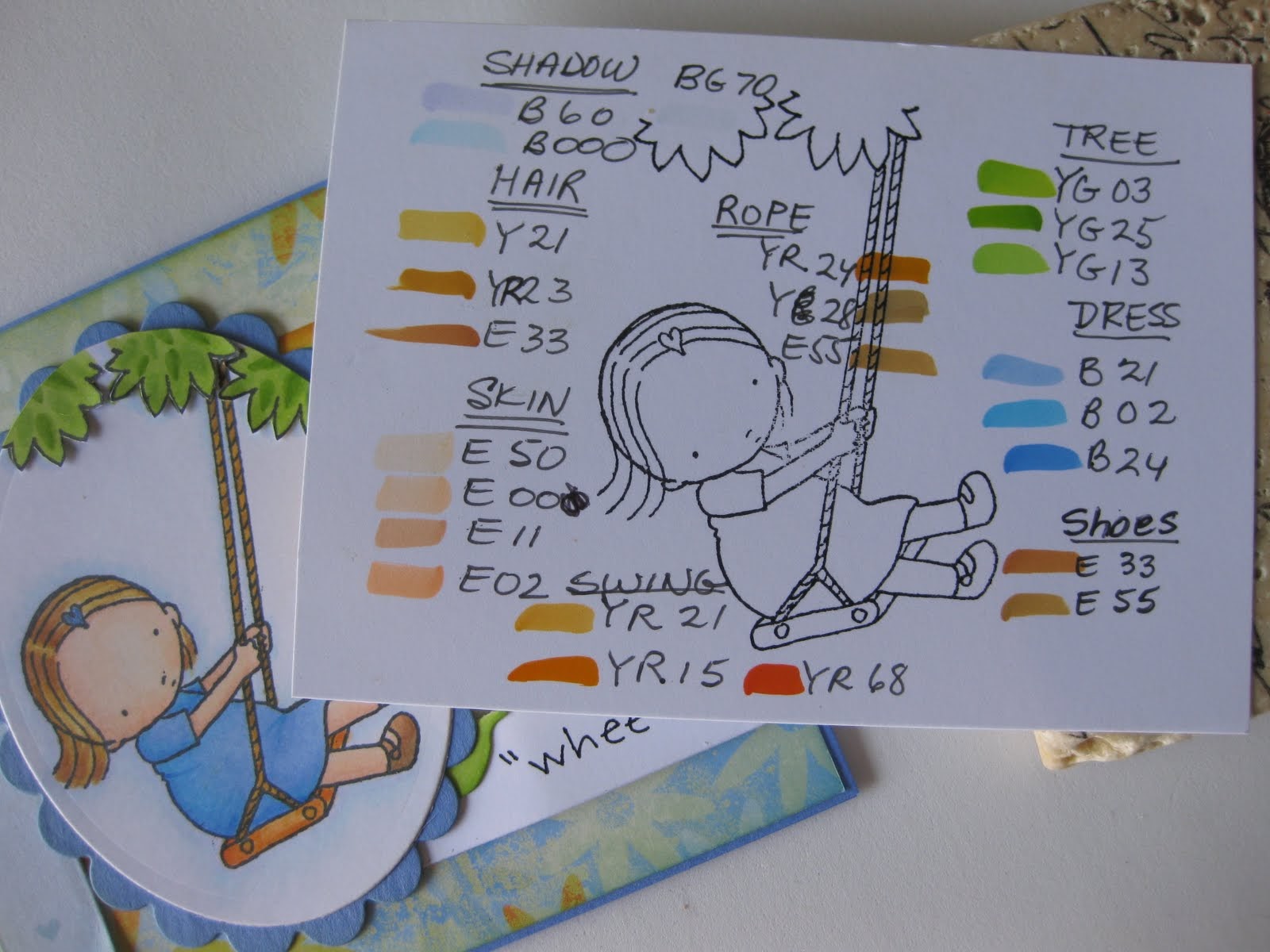
MFTWSC70 - Wheee!

 
This PI girl just makes me smile. She is stamped in tuxedo black on copic X-press it paper. I have included an index of the copic markers that I used at the end of this post.The colors were chosen to match the paper. I usually color the image and then try to find paper; this time I started with DP from my stash and then chose markers to match. The card base and scalloped background (nestablilty die) are retired SU cardstock: Ballet Blue. The thin edge of orange is actually white cardstock that has been inked with honey distress ink.


 I also added honey distress ink to the ribbon (by SU) and to the felt rolled rose (felt and die are both from MFT) because they were just too yellow.  Both the ribbon and the rose are spritzed with Perfect Pearl Misters in Sunflower for a bit of glitz that just doesn't show up well in photos.
The MFT flourish die is set behind the flower. I colored white CS with the same green markers used in the tree leaves because I didn't have the perfect green CS to use. I trimmed the stamp set's sentiment and just used part.It is stamped on white CS cut from the MFT fishtail die (as is the other one on the front and the three on the inside). The end of the fishtail is raised slightly with foam tape.
 I hope she makes you smile too.